TYPEFACE (FALL 2023)
Brief
Goal
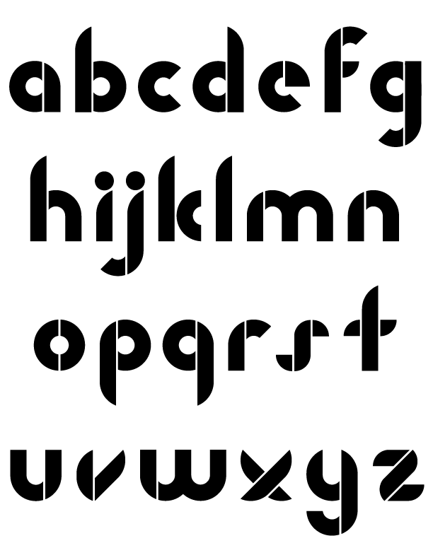
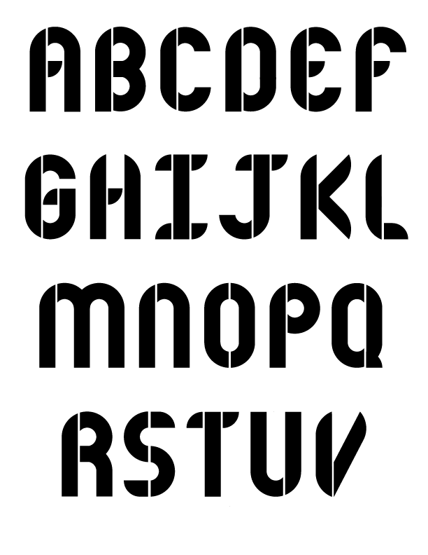
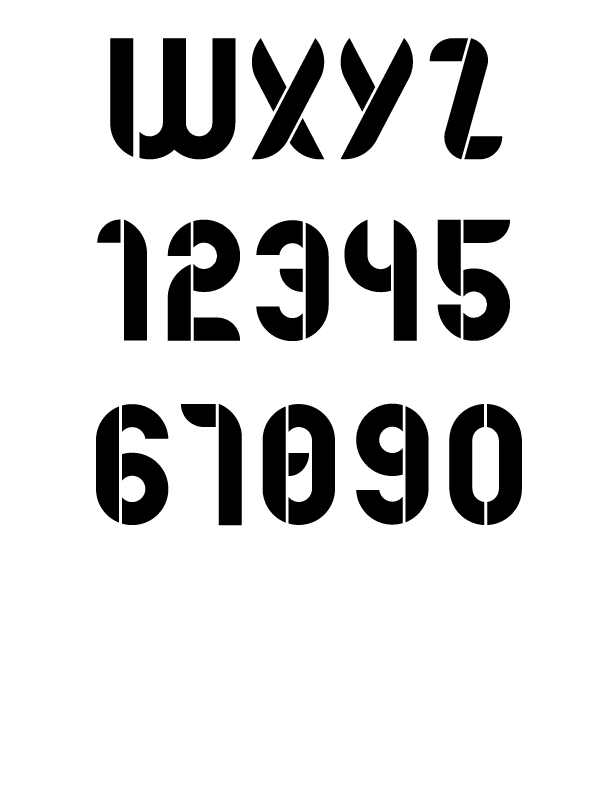
For an introductory typography class, each of us were tasked with creating a typeface from scratch. To extend the project, where it would’ve ended at final sketches, I decided to fully digitize my typeface. The main restriction of this project was the time constraint, having to make it from start to finish in about 2-3 months.
My inspirations for my typeface were fonts like Futura and Serifa. I decided to base my font off of a perfect circle, and adapt it as needed when different letters called for it. The goal of my font was seeing how far I could stretch a few simple parameters to create a simplistic and rounded font.
Methods
Lessons
- Started with basic concept sketches on paper, brainstorming the direction to go with the typeface.
- Took various concepts and sketched out each letter in the lowercase set.
- Refined the lowercase sketches by using a tracing paper overlay, measuring and sketching down the components of the letters on a line to be equal to the others.
- Started the uppercase and numbers concepts.
- Refined uppercase sketches by using the same tracing paper overlay method.
- Took all of the refined sketches and used a photo scanner to get them as PNGs.
- Put the scans into adobe illustrator to manually digitize the typeface.
- Made final revisions and tweaks when the entire set was digitized. My professor loosely oversaw each previous step but this one was especially important communication between us for the critiques.
- What makes a good typeface… good. I’d say this includes multiple factors of the design, readability, and practicability.
- The importance of consistent set width and height
- How to create a cohesive set of something, having it all work together instead of as separate letters.